The Science of Colour - The Light Source.
Share
Hey there, fellow color enthusiast!
I'm thrilled to dive into the captivating world of color science with you, and I've got some colorful topics in store for our future discussions. From the physics behind color to unraveling the very essence of what color truly is, and even deciphering the secret code of colors, there's so much to explore together. So, buckle up, because we're about to embark on a colorful journey like no other! 🌈🔍✨
Now, let's delve into the first part of our color triad—the radiant light source. As we all know, we mostly perceive colors in the presence of our faithful companion, daylight. But, oh, how intriguing and nuanced this relationship between light and color truly is!
You see, the way we perceive colors is far from simple or one-dimensional. Daylight is a rather fickle friend. It can change its demeanor with the weather—sometimes shy behind clouds, other times obscured by smoke pollution. The time of year and even the time of day can influence its temperament. Yet, amidst all this variability, the objects we gaze upon remain steadfast, holding their colors as secrets meant only for the discerning eye.
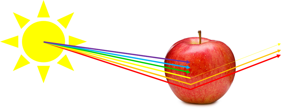
But, here's the twist! The very essence of color lies in the dance between these dynamic light sources and the unchanging objects. As light sources shift, so do the colors we perceive. Light bulbs and radiant objects play a role too, casting their own unique wavelengths onto the stage. These wavelengths, in turn, influence how an object reflects light, thus painting it with different hues. So, imagine this: an apple basking under the gentle glow of fluorescent lights will sport a different shade of red than its counterpart bathing in the golden rays of daylight.
And here's where fabric enthusiasts like us come into the story! How many times have we been entranced by a fabric's vibrant hue under the fluorescent lights of a store, only to be surprised by its true colors in the unforgiving light of day? It's a delightful example of the ever-elusive color constancy that plays tricks on our eyes when we shop under one light source and create under another.
The same color transformation occurs in the realm of photography. How often have we snapped a picture of a beautifully hued quilt, only to find that our computer screen fails to capture the essence of those colors? A significant part of this enigma lies in the disparity between how colors manifest on digital screens, using the additive RGB (Red/Green/Blue) model, and the subtractive CMYK (Cyan/Magenta/Yellow/Black) model that reigns supreme in the colorful world of fabrics. But fret not; we'll unravel this mystery in a future blog post!
So, my fellow color explorer, I hope you're as excited as I am to continue this colorful journey together. Stay tuned for more insights into the captivating world of color! 🌟🎨🌞
Happy Quilting
Jody
I'm thrilled to dive into the captivating world of color science with you, and I've got some colorful topics in store for our future discussions. From the physics behind color to unraveling the very essence of what color truly is, and even deciphering the secret code of colors, there's so much to explore together. So, buckle up, because we're about to embark on a colorful journey like no other! 🌈🔍✨
Now, let's delve into the first part of our color triad—the radiant light source. As we all know, we mostly perceive colors in the presence of our faithful companion, daylight. But, oh, how intriguing and nuanced this relationship between light and color truly is!
You see, the way we perceive colors is far from simple or one-dimensional. Daylight is a rather fickle friend. It can change its demeanor with the weather—sometimes shy behind clouds, other times obscured by smoke pollution. The time of year and even the time of day can influence its temperament. Yet, amidst all this variability, the objects we gaze upon remain steadfast, holding their colors as secrets meant only for the discerning eye.
But, here's the twist! The very essence of color lies in the dance between these dynamic light sources and the unchanging objects. As light sources shift, so do the colors we perceive. Light bulbs and radiant objects play a role too, casting their own unique wavelengths onto the stage. These wavelengths, in turn, influence how an object reflects light, thus painting it with different hues. So, imagine this: an apple basking under the gentle glow of fluorescent lights will sport a different shade of red than its counterpart bathing in the golden rays of daylight.
And here's where fabric enthusiasts like us come into the story! How many times have we been entranced by a fabric's vibrant hue under the fluorescent lights of a store, only to be surprised by its true colors in the unforgiving light of day? It's a delightful example of the ever-elusive color constancy that plays tricks on our eyes when we shop under one light source and create under another.
The same color transformation occurs in the realm of photography. How often have we snapped a picture of a beautifully hued quilt, only to find that our computer screen fails to capture the essence of those colors? A significant part of this enigma lies in the disparity between how colors manifest on digital screens, using the additive RGB (Red/Green/Blue) model, and the subtractive CMYK (Cyan/Magenta/Yellow/Black) model that reigns supreme in the colorful world of fabrics. But fret not; we'll unravel this mystery in a future blog post!
So, my fellow color explorer, I hope you're as excited as I am to continue this colorful journey together. Stay tuned for more insights into the captivating world of color! 🌟🎨🌞
Happy Quilting
Jody