The Science of Colour: Harmonizing with Triads!
Share
Tips for Using Triadic Colour Schemes in Quilting
Another installment in the Science of Colour...
Have you ever struggled to pull together colours for your latest project?
Let's simplify the basics!
What is a Triad?
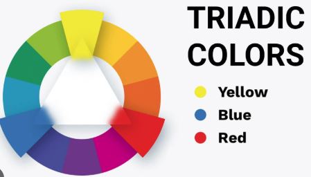
It is a combination of three colours on the colour wheel, evenly distributed from each other, forming an equilateral triangle. For example, Yellow, Blue and Red are a triadic colour combination. But so are Orange, Purple and Green! (See the photo above)
The colour wheel is your best resource for picking colours for your quilts! You can pick one up at any art store or Amazon will deliver! Now that you know what a triad is, let’s dive into the details of making the most of a triadic palette in your quilting projects.
⭐ Choose a Dominant Colour
Pick one colour to take center stage, setting the tone for your quilt. Your other two colours should complement it without competing for attention.
⚖️ Balance and Proportion
Avoid letting one colour overwhelm the others. Instead, distribute your colours thoughtfully, letting your dominant hue shine while the other two provide depth and harmony.
🔥 Mix Warm and Cool Tones
Triadic schemes often include a mix of warm and cool colours. Leverage this contrast to add dimension, making your quilt feel more dynamic and engaging.
🎨 Experiment with Shades and Tints
Play around with lighter and darker versions of your triadic colours. Using tints (lighter shades) and tones (muted versions) can add subtlety and sophistication to your quilt design.
🌿 Incorporate Neutrals for Balance
If your triadic palette feels a little too bold or busy, introduce neutrals like gray, beige, or white. These colours soften the intensity, giving your quilt a more polished and refined look.
Final Thoughts: Let Your Quilts Shine with Triadic Colours!
The triadic colour scheme is a quilter’s best friend—giving you a beautiful balance of contrast and harmony in every stitch. Whether you’re looking for bold energy or subtle elegance, this approach lets you explore the full potential of colour while keeping your design cohesive and captivating. So go ahead, experiment with triadic palettes, play with shades and intensities, and let your quilts shine with the perfect blend of hues.
Happy Sewing!
Jody