At the heart of this exploration of colour lie the primary colours – red, blue, and yellow. These foundational hues set the stage for our journey into the realm of colour. By blending these primary colours skillfully, we unlock a wide range of secondary and tertiary colours, enriching our quilts with a diverse palette of shades.
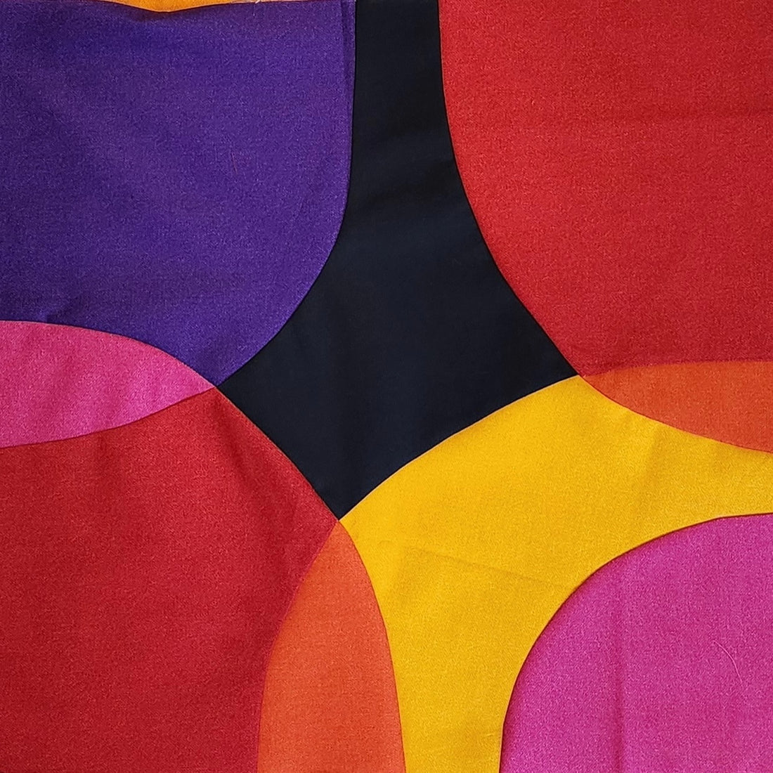
Understanding Colour Vision and Mixing: To delve into colour mixing, it's essential to grasp the basics of colour perception. The primary colours—red, green, and blue—serve as the building blocks, influencing how our eyes perceive different hues. With this understanding, we can leverage the principles of colour theory to create harmonious blends of secondary and tertiary colours. Technically, in a quilt, we don’t combine colours, but when colours are put side by side, they influence each other (see Blog Post #9). You can also create colour mixing by using transparency. For example, in the image above, it appears that the red curves are overlaying the yellow curve. This is done by using a secondary colour, orange, which is a combination of red and orange. The combinations are endless!
Crafting Visual Harmony with Colour Contrast: Colour contrast plays a pivotal role in visual storytelling. By embracing contrast, whether through complementary colours or the interplay of warm and cool tones, we can create captivating effects in our quilts. These contrasting elements not only draw the viewer's attention but also add dimension and interest to our creations. With colour contrast as a guide, we can strategically highlight focal points and evoke different moods within our quilts.
Navigating Colour Theory: Colour theory serves as our roadmap in the world of quilting. It provides a framework for understanding the relationships between colours and their harmonious combinations. At its core, the colour wheel serves as a valuable tool, guiding us in selecting complementary and analogous colour schemes. By applying these principles, we can create quilts that are visually cohesive and impactful, conveying our artistic vision with clarity.
Unlocking the Psychology of Colour: Colour psychology offers insights into the emotional responses elicited by different colours. By tapping into these associations, we can create quilts that evoke specific feelings and sentiments. Whether it's energizing reds or calming blues, each colour choice contributes to the overall mood and atmosphere of our quilts, inviting viewers to engage with our creations on a deeper level.
Ready to embark on your own colour-filled quilting journey? Let's explore the endless possibilities of colour mixing and design, one stitch at a time. Happy quilting!
Jody
Gingerberry Quilts